
Phornphan Bakery
Phornphan Bakery is a family-owned bakery house established in 1967 (in Thai year, 2510). The brand is well-known for its large volume bread supply at affordable prices. When the successor has taken on the brand, I have an opportunity to work on their visual rebranding. The purpose is to make the brand look and feel modern and minimal appealing to the existing audience while capturing the new crowd attention.
BRAND MOTTO
High end quality, low on price.
We believe bakery should be accessible and affordable to all demography. We commit to use as premium ingredients as available in a more budget-friendly way possible.
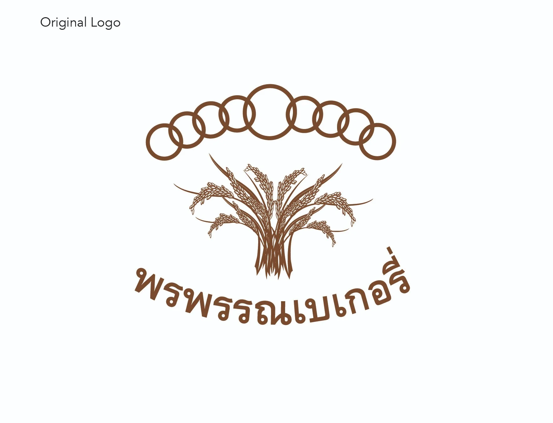
DESIGN OBJECTIVES
To create a more explicit system of graphic usage and introduce better visual system flexibility.
To minimize and modernize the logomark.
To present the incorporation of 9 rings in different ways.
(The symbol of 9 rings holds a special meaning to the founder family.)

NEW Brand Identity Overview


NEW PACKAGING DESIGN


