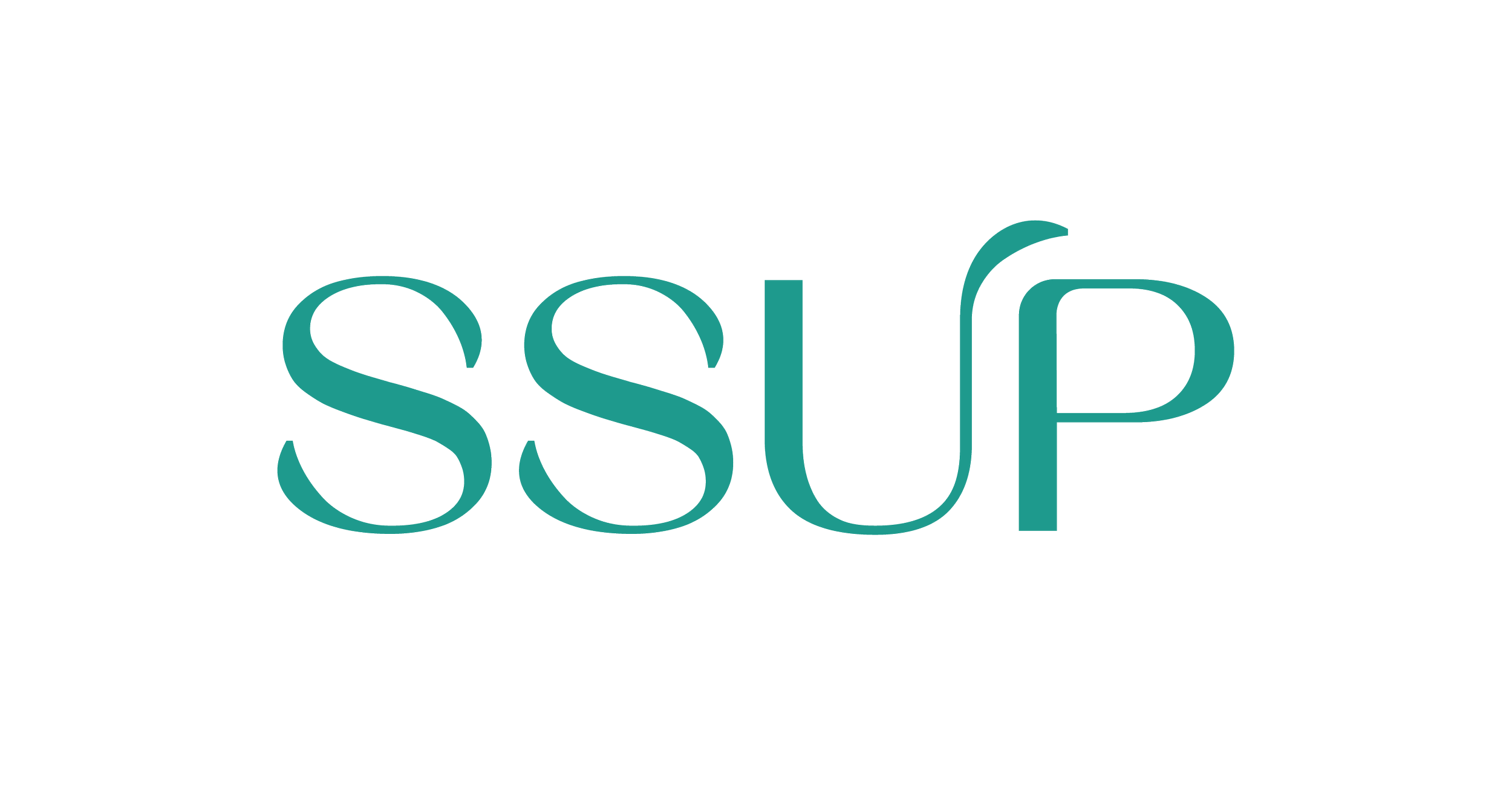
SSUP
SSUP is Thailand’s largest beauty and wellness conglomerate. As a part of the QUO team, I redesigned the SSUP logo and its affiliates; developed corporate identity guidelines for the SSUP group; and created a various number of brand applications.
DESIGN approach
Letterform
An elegant, contemporary letterform that is striking yet subtle, confident yet humble. With its rounded, flowing shapes and distinctive curves, the letters appear to flow into each other, creating a sense of harmony and forward motion.
The ‘U’ with its discreet yet distinctive flourish; the leaf shape appears to grow into the ‘P’ as a nod to the group’s commitments to nature and the environment, but also a symbol of growth, well-being and SSUP’s nurturing personality.
colourS
The brand colour palette consists of shades inspired by the beauty of Thai nature and culture and rooted in materials that are both natural and cultural treasures. It reflects a beauty that is precious, natural and Thai.
Primary colours:
Andaman Green – speaking to the freshness, restorative and nurturing power of nature and the ecosystem similar to the colour of the Andaman Sea, always paired with White.
White – speaking to purity, honesty, and perfection.
Secondary colours:
Dark Agarwood – an earthy neutral shade drawn from a prized and fragrant resinous wood exported from Thailand across the globe.
Silalang Brown – an orange-ochre brown drawn from a sustainable indigenous material used to build the temples and palaces of Ayutthaya.
FROM A GLOBAL PERSPECTIVE
Despite being Thailand’s beauty industry leader, SSUP holdings desire to step up to compete internationally with Estee Lauder, Kose, and Shiseido, to name a few. The simple yet organic form of typefaces represents beauty and the bold ambition; the poetic gesture and fresh teal-green colour speak to their commitment to live in harmony with the planet.


