
Western Union
As a part of the School of Visual Arts, NYC, I had a chance to work in the Western Union project in identifying brand challenges; redefining the positioning strategy; proposing ideas for improvement.
Western Union is in the business of moving money globally, differentiated by being bold, reliable and inclusive. However, the brand communications have been all over the place – the existing logo has been used in too many variations and formats.
To overcome the challenge, I, along with my team at SVA Branding 2018, proposed the brand strategy (Money without borders) and logo & brand communication redesign.

We believe that getting your money to your friends and family shouldn’t require access to bank accounts, big credit card corporations, delays or technology. That’s why at Western Union we’ve cleared the path for you. Wherever you are in life you have a bold and reliable financial partner, because the ability to get money quickly to the people and places that matter most is something that we all deserve.
LoGO simplification
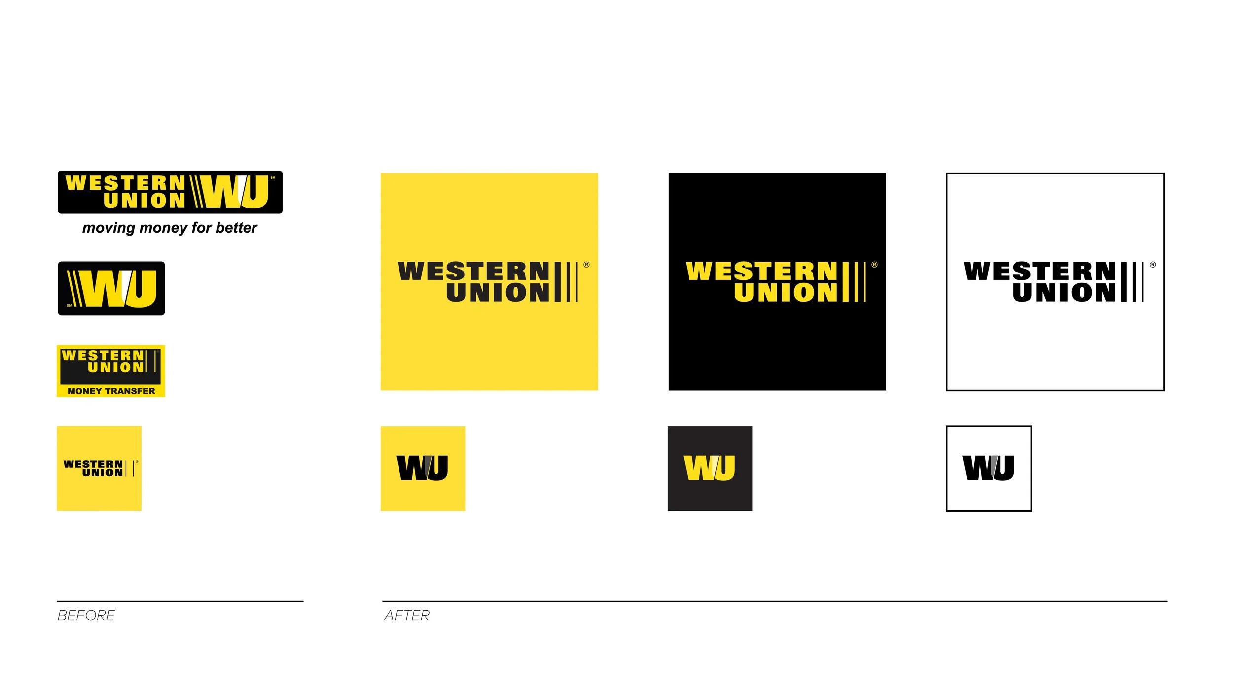
Introduce a clearer system flexibility


…